Struggling to create a cohesive brand identity across platforms? In this blog, we’ll explore powerful strategies to align your brand visuals, ensuring consistency and recognition. Learn how to synchronize colors, typography, and graphics to build a strong, memorable identity. Discover why brand personality alignment is the secret weapon for standing out in the digital world.
Table of Contents
- Introduction: Why Brand Identity Alignment Matters
- Understanding Brand Identity and Its Core Elements
- How to Align Your Visuals Across Platforms
- Color Palette Consistency
- Typography and Fonts
- Logo Usage and Placement
- Creating Platform-Specific Visuals Without Losing Identity
- Tools to Streamline Brand Identity Alignment
- Conclusion: Your Action Plan for a Stronger Brand Identity
Why Brand Identity Alignment Matters
In today’s digital-first world, your brand isn’t just what you sell — it’s how you look, speak, and connect across platforms. Brand identity alignment ensures your visuals, from Instagram to your website, tell the same story. It’s the glue that holds your brand’s personality together, helping you build trust, recognition, and loyalty.
Think of your favorite brands — Nike, Apple, or Chanel. What makes them memorable? It’s their consistent use of colors, logos, and fonts across every touchpoint. Without brand personality and voice alignment, your audience might feel confused or disconnected, weakening your brand’s impact.
Let’s break down how you can master brand voice alignment and create a seamless presence across platforms.
Understanding Brand Identity and Its Core Elements

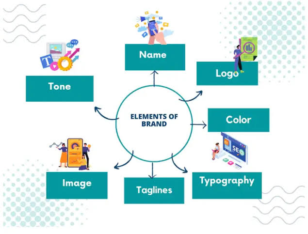
Before aligning your visuals, you need to understand what makes up a brand identity. It’s more than just a logo — it’s a combination of elements that visually and emotionally represent your brand:
- Logo: The face of your brand.
- Color Palette: A set of colors that reflect your brand’s personality.
- Typography: The fonts you use consistently across all platforms.
- Imagery and Graphics: Icons, illustrations, and photography style.
- Tone of Voice: While not visual, your brand’s voice must match its visual identity.
These elements work together to create a strong brand identity. When one is out of place, your brand feels disjointed.
How to Align Your Visuals Across Platforms
1. Color Palette Consistency
Your color palette is one of the most powerful tools in brand identity alignment. Choose 3–5 core colors — a primary color, secondary colors, and an accent — and stick to them.
- Use the same HEX codes for digital platforms.
- Ensure all graphics, backgrounds, and buttons reflect your palette.
- Don’t overuse colors — balance is key.
Pro tip: Tools like Canva or Adobe Color can help you maintain color consistency effortlessly.
2. Typography and Fonts
Typography sets the mood for your brand. Whether it’s bold, playful, or sophisticated, using consistent fonts strengthens brand identity alignment.
- Pick 1–2 fonts: one for headings, one for body text.
- Ensure fonts are available on all platforms — Google Fonts is a great resource.
- Avoid mixing too many typefaces, which can create visual chaos.
Keep your typography simple yet memorable — the goal is clarity and cohesion.
3. Logo Usage and Placement
Your logo should be instantly recognizable, but how you use it matters just as much. Brand identity alignment means:
- Using the same logo version across platforms (full, icon, or wordmark).
- Ensuring logo placement is consistent — top left corner on websites, bottom center for Instagram posts, etc.
- Keeping logo sizes proportional and ensuring they don’t distort across platforms.
Consistency makes your logo a symbol of trust.
Creating Platform-Specific Visuals Without Losing Identity
It’s easy to get carried away with trendy designs for different platforms, but brand identity alignment means tailoring visuals without sacrificing core elements.
- Instagram and TikTok: Use engaging graphics but stick to your color palette and fonts.
- Website: Maintain the same visual elements, ensuring seamless navigation and brand flow.
- Email Marketing: Your headers, buttons, and images should reflect your brand identity.
Adapt but never abandon — your visuals should “speak” the same language everywhere.
Tools to Streamline Brand Identity Alignment
Staying consistent is easier with the right tools:
- Canva Brand Kit: Store your logo, fonts, and color palette for quick access.
- Adobe Creative Cloud: Advanced tools for cohesive, high-quality design.
- Trello or Notion: Create a brand identity alignment guide for your team to follow.
Having a system in place prevents design mishaps and ensures your brand visuals stay sharp.
Conclusion: Your Action Plan for a Stronger Brand Identity
Ready to master brand identity alignment? Here’s your action plan:
- Define your brand’s core elements — logo, colors, fonts, and imagery.
- Create a brand kit for easy access to design assets.
- Ensure visuals stay consistent across every platform.
- Adapt visuals for platform-specific needs without losing identity.
- Use tools like Canva and Adobe to streamline the process.
Brand identity alignment isn’t a one-time task — it’s an ongoing strategy. When done right, it boosts brand recognition, builds trust, and sets you apart from the competition.


