

Turn Menus Into Maps: Intuitive Navigation Design 101
Master intuitive navigation design for seamless user flow. Boost website usability with smart menu design that drives UX and engagement.
Table of Contents
- The UX Secret Sauce? Intuitive Navigation Design
- What is Intuitive Navigation Design?
- Why Website Usability Hinges on Smart Menu Design
- Best Practices for Intuitive Navigation Design
- Examples of User-Friendly Menus that work
- Intuitive Navigation Design Done Right: Let Your Menu Guide, Not Confuse
The UX Secret Sauce? Intuitive Navigation Design
Ever clicked off a website simply because the menu made no sense? You’re not alone. Poor navigation menus are the silent killers of conversions.
This blog will help you master intuitive navigation design, a key UX tool that ensures your site is easy to explore, making visitors stay longer and convert faster. It’s not just about aesthetics — it’s about website usability, smart UX design, and delivering a frictionless user journey.
What Is Intuitive Navigation Design?
Intuitive navigation design means creating menus so natural and obvious that users know exactly where to click — without thinking. Think of it as a subconscious guide that effortlessly directs users to what they need.
The best UX design begins with empathy. If your navigation mimics the way users think and behave, they won’t get lost. They’ll flow through your site like it’s second nature.
We’re not designing just a menu here — we’re creating a roadmap for discovery.
Why Website Usability Hinges On Smart Menu Design
Your menu structure directly impacts website usability. A cluttered, inconsistent, or overcomplicated menu turns users off fast. But an intuitive navigation design creates a seamless experience from homepage to checkout.
According to UX research, users form judgments about a website in 0.05 seconds. Your navigation menu is one of the first things they see. Want them to stay? Make it intuitive.
How to create intuitive navigation menus isn’t just a question of layout — it’s about anticipating user intent. Ask:
- What are they looking for?
- How many clicks does it take to find it?
- Are the labels crystal clear?
Best Practices For Intuitive Navigation Design
Let’s break down what effective intuitive navigation design looks like in action:
1. Keep It Simple and Predictable
If users can’t predict what a menu item leads to, you’ve already lost them. Stick to standard terms like “Home,” “About,” or “Contact” unless your branding absolutely demands creativity.
2. Prioritise Based on User Intent
Your most important pages (e.g., Services, Products, Blog) should be front and center. Organise based on what’s most helpful to your users.
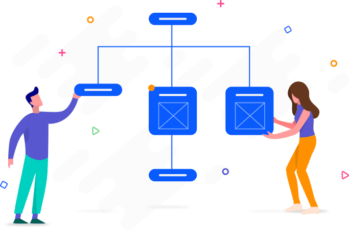
3. Use Clear Visual Hierarchy
Group related items together. Use dropdowns wisely. A good menu structure mimics a logical flow — it’s not a dumping ground for every link.
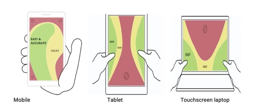
4. Optimise for Mobile Navigation
Mobile users behave differently. A hamburger menu might be common, but it needs to be responsive, discoverable, and easy to tap.
5. Test, Track, Iterate
Use heatmaps and A/B tests. Even the most thoughtful intuitive navigation design can improve over time.
Examples Of User-Friendly Menus That Work
Let’s look at some real-world examples of good navigation design:
- Apple: Simple top menu, laser-focused categories, no clutter.
- Dropbox: Clean layout with short, clear menu labels.
- Airbnb: Prioritises actions users want to take, like “Book” or “Explore.”
These brands nail the concept of designing user-friendly navigation for websites. They put user logic first — and that’s why their UX design wins.
Intuitive Navigation Design Done Right: Let Your Menu Guide, Not Confuse
Think of intuitive navigation design as the silent concierge of your site — always guiding, never interrupting. If you want visitors to stay, explore, and convert, give them a clear path. Great navigation menus don’t shout; they whisper confidence.
Now, go beyond looks. Rethink how you structure menus. Revisit website usability. Audit your current setup using effective menu structure for better usability.
Let your navigation guide your users — not frustrate them.
Ready to Restructure Your Site’s UX?
Start with intuitive navigation design — it’s your first step to lowering bounce rates and boosting conversions.