
Master dark mode design for smart UX with aesthetic principles, dark theme UI, and mobile design tips. Boost usability with expert dark mode strategies.
Table of Contents
- Introduction to Dark Mode Design
- Why Is Dark Mode Design More Than Just a Trend?
- Aesthetic Principles of a Strong Dark Mode Design
- Functional Considerations in Dark Mode Design
- Dark Mode Accessibility & User Experience
- The Future of Dark Mode Design
- Conclusion: Go Bold, Go Dark
Introduction To Dark Mode Design
Ever wondered why your favorite apps look so sleek in the dark? That’s the beauty of dark mode design—a blend of visual appeal, user experience (UX), and functionality.
And in today’s digital-first world, staying ahead of these trends can set your product miles apart.
From mobile design to websites, users crave a seamless experience—and dark mode design delivers just that. But how do we make it work? How do we balance form with function?
This blog unpacks the aesthetic and functional essentials of dark mode design, so your interfaces don’t just look great—they perform even better.
Why Is Dark Mode Design More Than Just A Trend?
A few years ago, dark themes were a niche preference. Today, they’re a design staple. But dark mode design is more than a visual upgrade—it’s a strategy that enhances UX and reduces eye strain.
It aligns with UI design best practices by making content pop and conserving battery life on OLED screens. It also supports modern mobile design by adapting to varying lighting environments, allowing for better focus and readability.
And let’s not forget the aesthetic edge. With a sleek black or charcoal background, even minimalistic elements take center stage. Your typography, icons, and images? They shine.
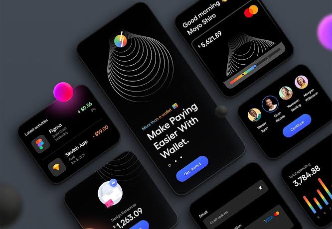
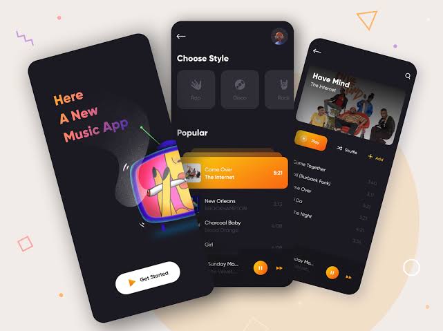
Aesthetic Principles Of A Strong Dark Mode Design
Designing a dark theme isn’t about inverting colours—it’s about creating harmony. Visual balance in dark mode is trickier than light mode. Without contrast, your entire UI could feel murky or overwhelming.
Here are a few aesthetic rules to guide you:
- Use desaturated colors: Bold neons on black may sound cool, but they fatigue users quickly.
- Maintain contrast: Contrast isn’t just about color—it’s about hierarchy. Headlines should stand out, but not glare.
- Typography matters: Use fonts with enough weight to remain readable. Avoid thin fonts that disappear into the dark.
- Focus on spacing: In dark mode design, white space (or negative space) keeps your UI breathable and digestible.
Whether you’re exploring the aesthetic principles of dark mode or just want your buttons to glow the right way, every detail matters.
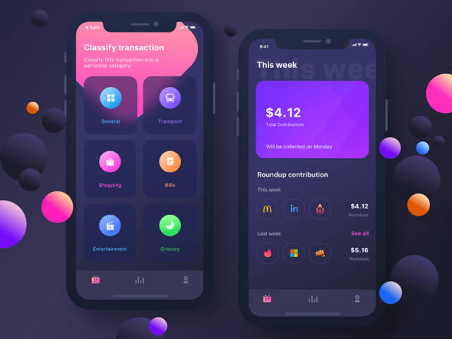
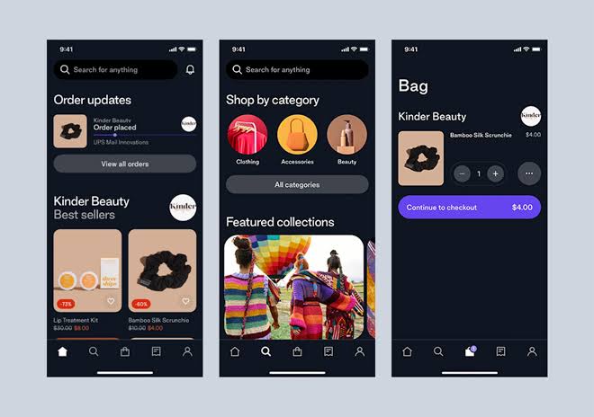
Functional Considerations In Dark Mode Design
Functionality is the backbone of every successful interface. And in dark mode design, functionality means legibility, usability, and adaptability.
Let’s talk function:
- Component Adaptation: Ensure all your components—from pop-ups to dropdowns—are designed to handle dark environments.
- State Management: Hover, active, and disabled states must be visually distinct. Otherwise, users get lost.
- Image and icon optimisation: Your icons and illustrations should include light and dark versions to avoid disappearing into the background.
If you’re wondering how to design for dark theme apps, make sure to A/B test every version across both themes to validate consistency.
Dark Mode Accessibility & User Experience
Accessibility in dark mode design is non-negotiable. Poor contrast can alienate users with visual impairments or low vision. So how do you make your dark mode accessible?
- Follow WCAG standards: Aim for a contrast ratio of at least 4.5:1 for normal text.
- Use motion wisely: Subtle animations can guide users without overwhelming them.
- Avoid pure black: Use deep grays for a softer, more comfortable viewing experience.
This ensures that the user experience in dark mode environments is intuitive, comfortable, and inclusive.
The Future Of Dark Mode Design
With the rise of adaptive and personalised interfaces, dark mode design is evolving. Operating systems now allow auto-switching between light and dark based on the user’s environment or time of day.
Brands that prioritise dark mode accessibility considerations and consistent UX design will likely build longer-lasting connections with their users.
Also, the future of branding lies in fluidity—and being adaptable in both light and dark mode design settings helps you meet users where they are.
Conclusion: Go Bold, Go Dark
So, why wait in the light when you can glow in the dark?
From balancing aesthetic principles to addressing functional needs, dark mode design offers a strategic advantage for brands and developers. With its rising popularity and strong impact on user experience, incorporating a well-crafted dark theme is no longer optional—it’s essential.
Whether you’re a UI designer, developer, or a brand strategist, adopting dark mode design with intention can elevate your product’s interface—and your user’s trust.
Ready to switch things up?
Start designing with intention. Let your next project shine in the dark.