

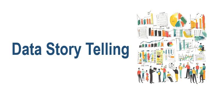
Pixels & Plots: Data Visualisation Meets Storytelling
Use data visualisation and storytelling techniques to transform raw data into engaging visuals. Learn data storytelling and visualisation techniques now!
Table of Contents:
- Transform Stories With Data Visualisation Techniques
- The Psychology Of Pictures: Why Data Visualisation Works
- Powerful Data Visualisation Techniques for Effective Storytelling
- Data Tools That Make Storytelling Easy
- When and Where to Use Data Visualisation Techniques for Effective Storytelling
- How to Tell Stories with Data Visuals That Actually Stick
- Conclusion: Let Your Data Speak Volumes
Transform Stories With Data Visualisation Techniques

In a fast-paced digital world, where attention spans are shorter than TikTok reels, capturing your audience’s focus is an art—and a science. Data visualisation isn’t just a design element; it’s a storytelling superpower.
Whether you’re pitching campaign results to a client or creating a killer social media report, the right data visualisation techniques for effective storytelling can make your message clear, credible, and unforgettable.
The Psychology Of Pictures: Why Data Visualisation Works

Humans are visual creatures. According to studies, 90% of information transmitted to the brain is visual. When data is presented with storytelling in mind, using powerful visualisation techniques, it becomes easier to process, remember, and act on.
This is where data storytelling shines—it turns metrics and KPIs into compelling narratives that resonate with your audience.
Powerful Data Visualisation Techniques For Effective Storytelling
Here are some tried-and-tested techniques that can elevate your storytelling game:
1. Use Hierarchical Visuals
Structure your visuals in a top-down approach. Charts that show a flow of information—like funnel charts or tree maps—help emphasise key insights.
2. Contrast for Clarity
Use contrasting colors to highlight trends or anomalies. It’s a simple trick, but it ensures your most important points pop.
3. Choose the Right Chart for the Right Data
Pie charts are great for part-to-whole relationships. Bar graphs work for comparisons. Don’t just use what looks pretty—use what communicates best.
4. Tell a Visual Story Arc
Start with a question, support it with visuals, and close with insights. This method boosts data storytelling effectiveness, especially on social platforms.
5. Animate Data for Engagement
Modern tools allow simple animations that guide your viewer’s eye. Motion can breathe life into your data when used sparingly.
By using these effective data visualisation techniques for storytelling, your content doesn’t just inform—it engages, persuades, and converts.
Data Tools That Make Storytelling Easy
As content professionals in a fast-paced marketing world, we don’t always have time to code or design from scratch. Here are the best tools that simplify data visualisation:
- Canva: Drag-and-drop visuals with modern templates
- Tableau: For interactive dashboards and detailed insights
- Infogram: Great for turning stats into social-ready infographics
- Google Data Studio: Perfect for clients who need regular reporting
These platforms help bring your data presentation to life while keeping your visuals client-ready and strategy-aligned.
When And Where To Use Data Visualisation Techniques For Effective Storytelling
- Pitch Decks & Proposals: Use visual storytelling to present campaign projections or growth metrics.
- Social Media Reports: Make client reporting more digestible and impactful.
- Blog Posts & Articles: Enhance engagement with infographics or animated charts.
- Email Campaigns: Embed small visuals to break up text and keep the reader scrolling.
- Webinars & Presentations: Support your speaker notes with dynamic graphs and visuals.
Using charts and graphs to tell a story helps simplify even the most complex datasets.
How To Tell Stories With Data Visuals That Actually Stick
Effective data storytelling isn’t about throwing in a pie chart just to look smart. It’s about guiding your audience toward an “aha” moment. Here’s how to make it happen:
- Start with a question your audience cares about.
- Support it using visuals with a clear narrative structure.
- End with a takeaway that inspires action.
That’s the secret to creating engaging data presentations that don’t just show numbers—but meaning.
Let Your Data Speak Volumes
In the digital age, showing is better than telling—and data visualisation techniques for effective storytelling are the ultimate way to show. Whether you’re a brand strategist, content creator, or data analyst, it’s time to let your numbers narrate, your metrics mesmerize, and your visuals speak volumes.
So, next time you build a deck, write a blog, or prepare a client report—ditch the dull, and turn to data visualisation. Your audience will thank you, your clients will notice, and your content will perform.
Ready to turn your data into stories that stick?
Let’s craft narratives your audience won’t forget.