
If You’re Not Using Bold Designs, You’re Invisible To Your Audience
Want to capture your audience’s gaze instantly? Bold designs are the game-changer your brand needs. In a digital world flooded with content, subtlety no longer works. This blog explores how bold designs command customer attention, boost engagement, and elevate your brand’s identity. Learn why daring visuals drive results and how you can master this powerful strategy.
Table of Contents
- Introduction: Why Bold Designs Matter in the Digital Era
- The Psychology Behind Bold Designs
- How Bold Designs Drive Customer Attention
- Incorporating Bold Designs into Your Brand Strategy
- Striking the Right Balance: Bold but not Overwhelming
- Real-World Examples of Brands Using Bold Designs Successfully
- Conclusion: Be Brave, Be Bold — Win Your Audience
Why Bold Designs Matter in the Digital Era
In today’s fast-paced digital landscape, grabbing customer attention is harder than ever. With millions of posts, ads, and videos flooding social media every day, how do you make sure your brand doesn’t get lost in the noise? The answer is simple: bold designs.
Gone are the days when subtle, understated visuals ruled marketing strategies. Modern consumers crave creativity, and bold designs — with their striking colours , daring typography, and dynamic layouts — ignite curiosity and demand attention.
But bold visuals aren’t just about being loud; they’re about communicating confidence, personality, and originality. Let’s break down why embracing boldness is the secret weapon your brand needs.
The Psychology Behind Bold Designs
Visuals are processed 60,000 times faster than text, and first impressions are formed within milliseconds. What does this mean for your brand? You have a tiny window to capture attention — and bold designs help you do exactly that.
Bright colors, high contrast, and unique patterns trigger emotional responses. Red stimulates excitement, yellow evokes happiness, and black signifies power. When strategically used, these elements make your brand memorable and distinguishable.
Moreover, bold visuals convey confidence. They tell your audience that you believe in your message and aren’t afraid to showcase it. This creates a magnetic pull, drawing customers toward your brand like moths to a flame.
How Bold Designs Drive Customer Attention
So, how exactly do bold designs grab and hold customer attention? Let’s dive into the key ways:
1. Instant Visual Impact
Humans are wired to notice what stands out. Bold colors, large fonts, and dynamic graphics immediately draw the eye, ensuring your content doesn’t just blend into the background.
2. Stronger Brand Recall
Brands like Nike and Spotify have mastered the art of bold designs. Their daring campaigns stick in your memory because the visuals are striking and unapologetically loud. This means customers remember you long after scrolling past your ad.
3. Boosts Engagement Rates
Studies show that content with bold, eye-catching visuals garners 94% more views. Whether it’s a vibrant Instagram post or a graphic-heavy website banner, bold visuals push users to stop, look, and engage.
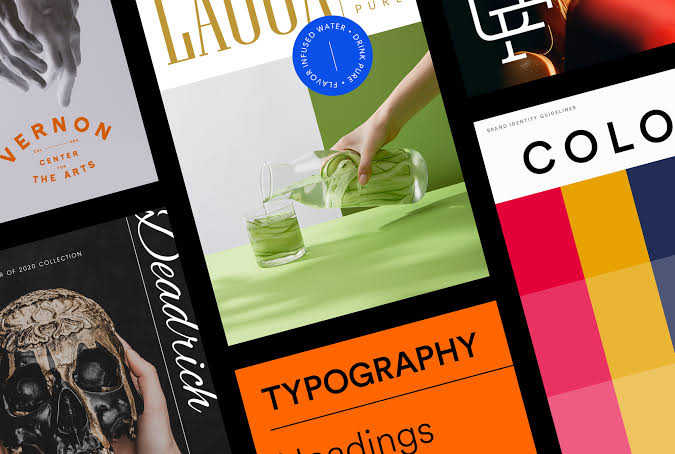
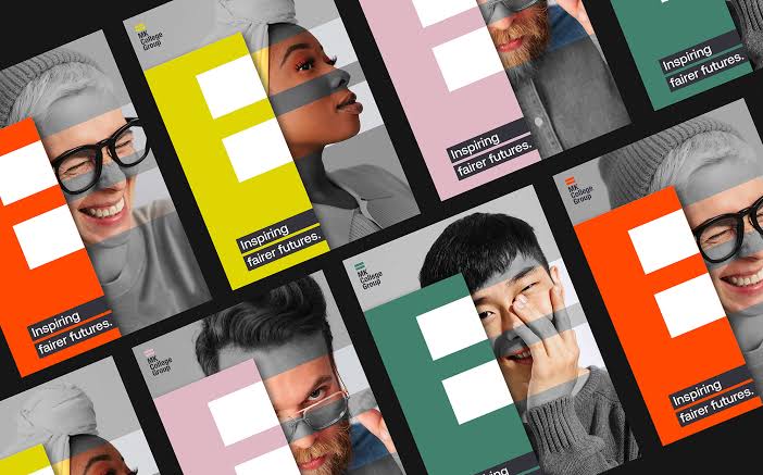
Incorporating Bold Designs into Your Brand Strategy
Embracing bold visuals doesn’t mean sacrificing elegance — it’s about balance and intention. Here’s how you can integrate them seamlessly:
1. Create a Bold Color Palette
Choose high-contrast colors that reflect your brand’s personality. Think bright accents combined with neutral tones for a modern yet daring look.
2. Experiment with Typography
Play with oversized fonts, geometric shapes, and contrasting text. Bold typography grabs attention and adds personality to your message.
3. Use Negative Space Wisely
While bold doesn’t mean chaotic, using empty space smartly allows your striking elements to pop without overwhelming the viewer.
4. Highlight Key Messages
Ensure your most important call-to-action (CTA) or tagline uses bold designs — bigger fonts, brighter colours — to guide the audience’s focus.
Striking the Right Balance: Bold but not Overwhelming
While bold designs captivate, overdoing it can backfire. The key is controlled creativity:
- Don’t overcrowd your design — let bold elements breathe.
- Use contrasting colors thoughtfully — too many can create visual confusion.
- Ensure readability — bold fonts should still be easy to skim.
Bold should be impactful, not messy. It’s about commanding attention without causing visual chaos.
Real-World Examples of Brands Using Bold Designs Successfully
Apple

Their minimal yet bold visuals approach combines clean layouts with striking product images.
Glossier

Pastel backgrounds with bold fonts create a chic yet loud identity.
Nike
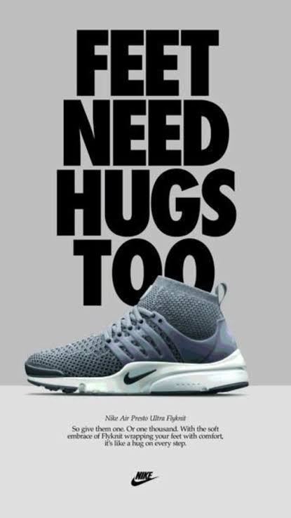
Unapologetically bold graphics and slogans scream confidence and push engagement.
These brands prove that bold visuals not only capture attention but build a unique visual identity customers remember.
Conclusion: Be Brave, Be Bold — Win Your Audience
In a saturated digital world, playing it safe won’t cut it. Bold designs have the power to break through the noise, capture customer attention, and build a strong, memorable brand.
So, ask yourself — is your brand bold enough? It’s time to embrace daring colors, strong typography, and dynamic layouts.
Be brave. Be bold. Get noticed.